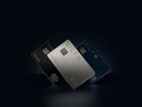
The original Bilt Mastercard was one card. Card 2.0 became three: Blue, Obsidian, and Palladium — a no-fee, a mid-tier, and a premium. The design challenge was building a system that could scale across all three tiers without losing what made the original card recognizable.
The answer was the map.The Noho Grid
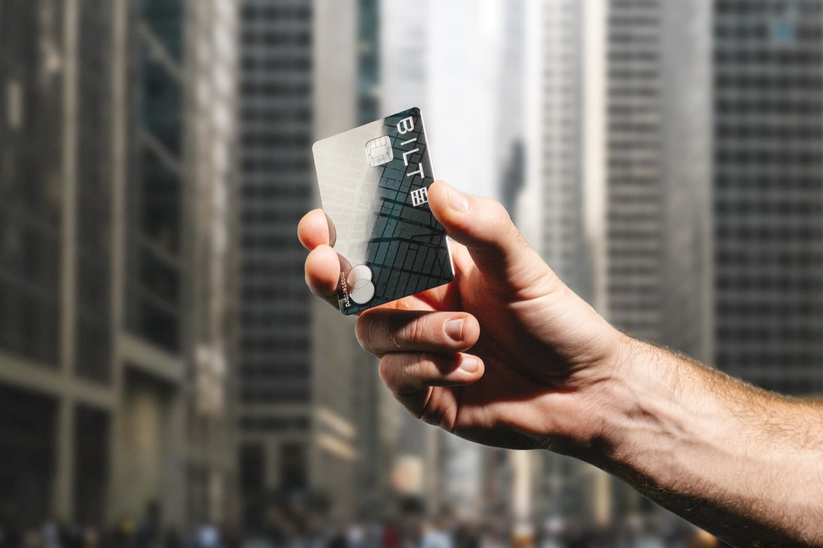
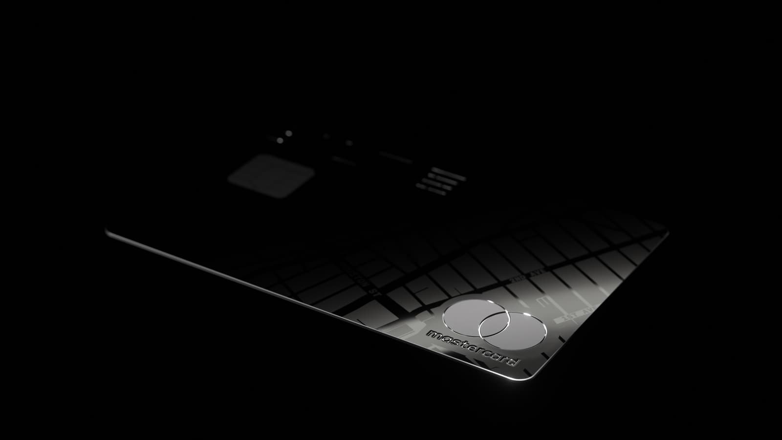
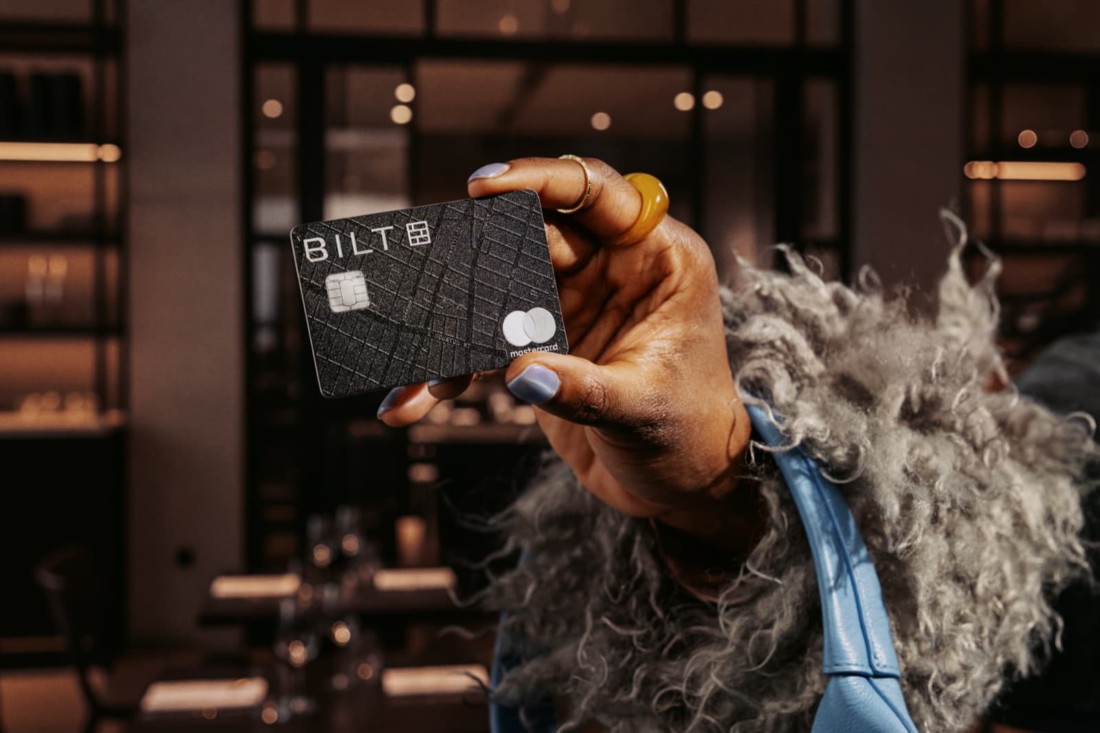
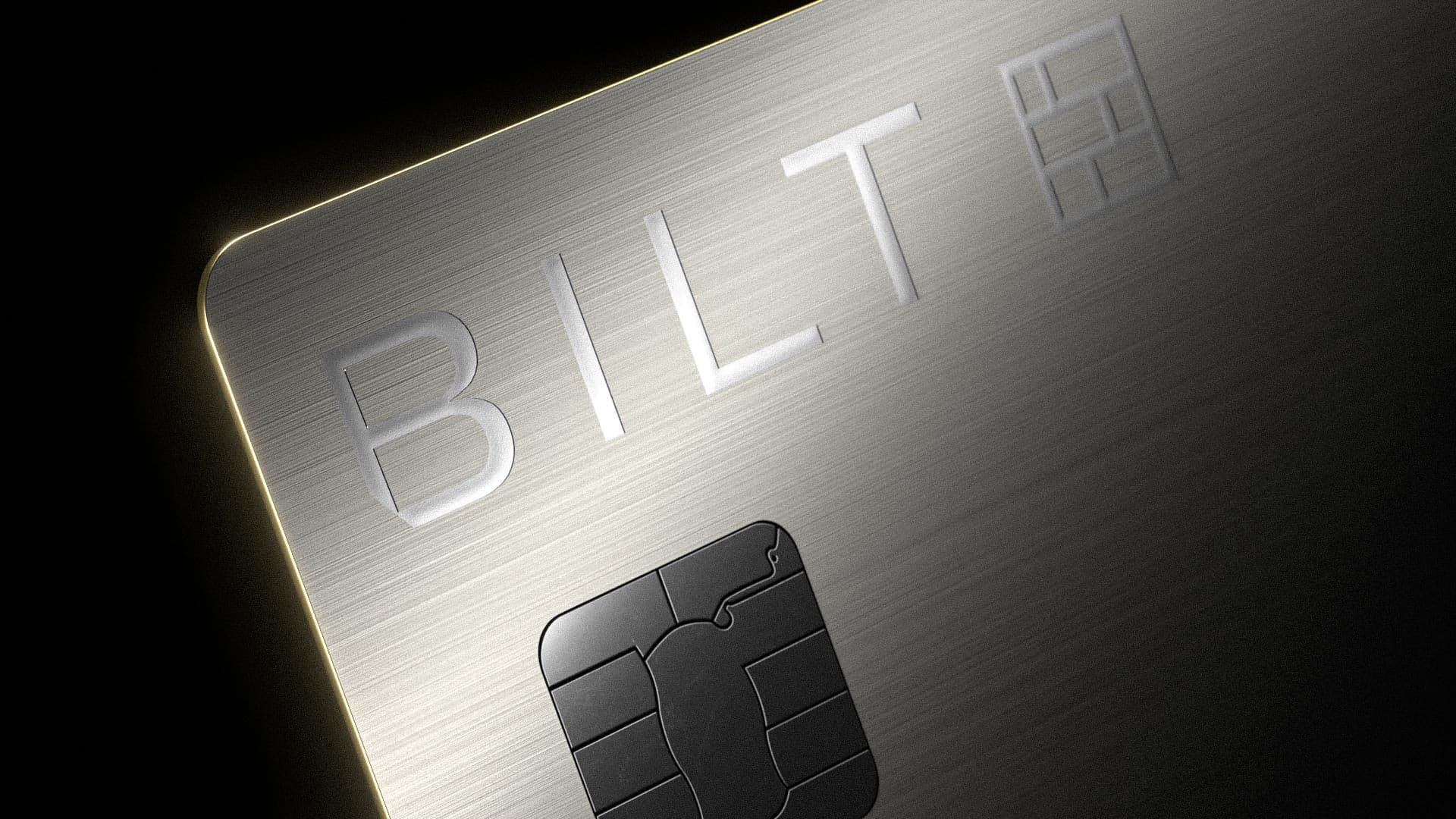
The surface pattern on every card is the street grid of Noho, New York — centered on Bond Street, where Bilt's original headquarters was located. It's not a generic city texture. It's a specific place, an homage to where the company started.
The meaning wasn't meant to be obvious at first glance. The map is embedded directly into the metal, becoming visible only through light and angle. You feel the card before you read it.
That pattern became the visual identity of the entire card system. It unifies all three tiers. Whether you're holding the Blue or the Palladium, you're looking at the same map.
Feel Over Visual Expression
The design prioritized physical presence over graphic loudness. Each card is metal — carefully weighted, machined, and finished. The Palladium card uses real palladium. We could have made the cards louder visually, but that would have missed the point. The material is the design.
Material as Hierarchy
The three cards share the same visual language. What changes is the material. The differentiation between tiers comes entirely from finish, weight, and metal — not from a different graphic treatment or color scheme.
That constraint keeps the system clean. You know which card someone is holding by how it catches the light, how heavy it sits in your hand. The design stays the same. The object changes.
Beyond the Card
The scope extended past the physical cards into the full launch — 3D renders, packaging, photography, and the launch video. Every touchpoint had to express the same material-first hierarchy. The renders had to communicate weight and finish on a screen. The photography had to show the cards in context — in hand, in wallet, in the city they're named after.