For most people, the Bilt Mastercard is the first physical thing they touch from the brand. No app onboarding, no website — just a card in a box. It has to introduce the entire company on its own.
That changes the problem. This isn't a graphic design exercise where you place a logo on a standard card. It's an industrial design problem. The material, the weight, the finish — these are the first impressions. They have to communicate something before the person reads a single word.
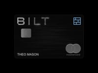
Material as Message
When a product is this small, material does most of the talking. The wrong finish on the right layout still feels cheap. The right finish can make something feel considered, intentional, worth holding onto.
We wanted the card to look nothing like a standard credit card. Not a bank product with a brand logo swapped in. Something that felt like it belonged to Bilt — as an object, not just as a surface.
The Unboxing Sequence
The packaging followed the same logic. The sequence matters: what you see first, what you touch, the order the story unfolds. Every step had to reinforce the same feeling the card itself carried.
Over one million cards have been distributed.