
A poster can give Phia the whole wall. A shopping interface needs to make room for what people came to find. Across these applications, the identity has to change its presence without losing its character.
My work on Phia’s brand identity covered the wordmark, color, typography, and art direction. An expressive name and a saturated blue connect the work, from campaign mockups to the quieter details of a shopping interface.
The interesting part is how much of the identity each setting needs.
The Wordmark
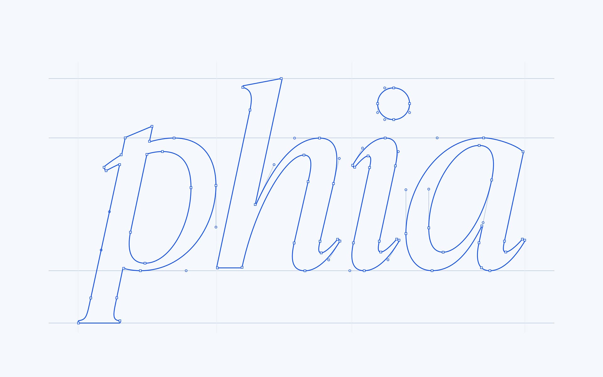
The wordmark has a little friction in it. Sharp, angled entries meet softer returning curves; compact spacing holds the name together while the descending p reaches below it. Those details give four letters enough character to carry a composition on their own.
The Blue
Blue is the most immediate part of the identity. It can take over a poster or appear as a small accent in the interface. Paper gives it a quieter companion: a pale blue-white that leaves room for photography. The same pair supports both a bold first impression and the smaller details around a product.

The Monogram
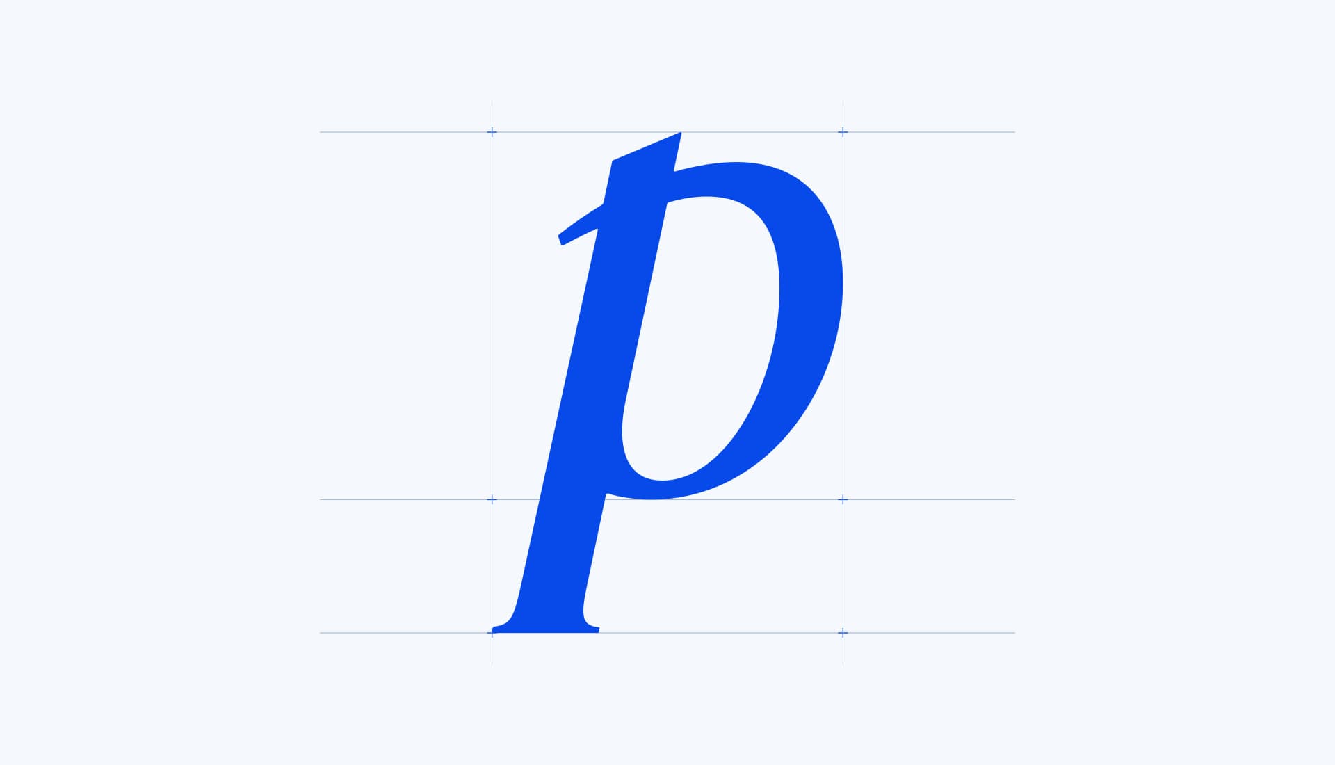
The p carries much of the name’s character on its own. Its angled entry, rounded counter, and long descender make the connection to the full wordmark visible even when the other three letters disappear.
Typography
The typography gives the identity another change of pace. GT Super Display brings expressive serifs and a sense of editorial scale. PP Neue Montreal offers a simpler rhythm around product names, prices, and navigation. The specimen moves from a large editorial statement to quieter headings, supporting text, and interface details.

Campaign Explorations
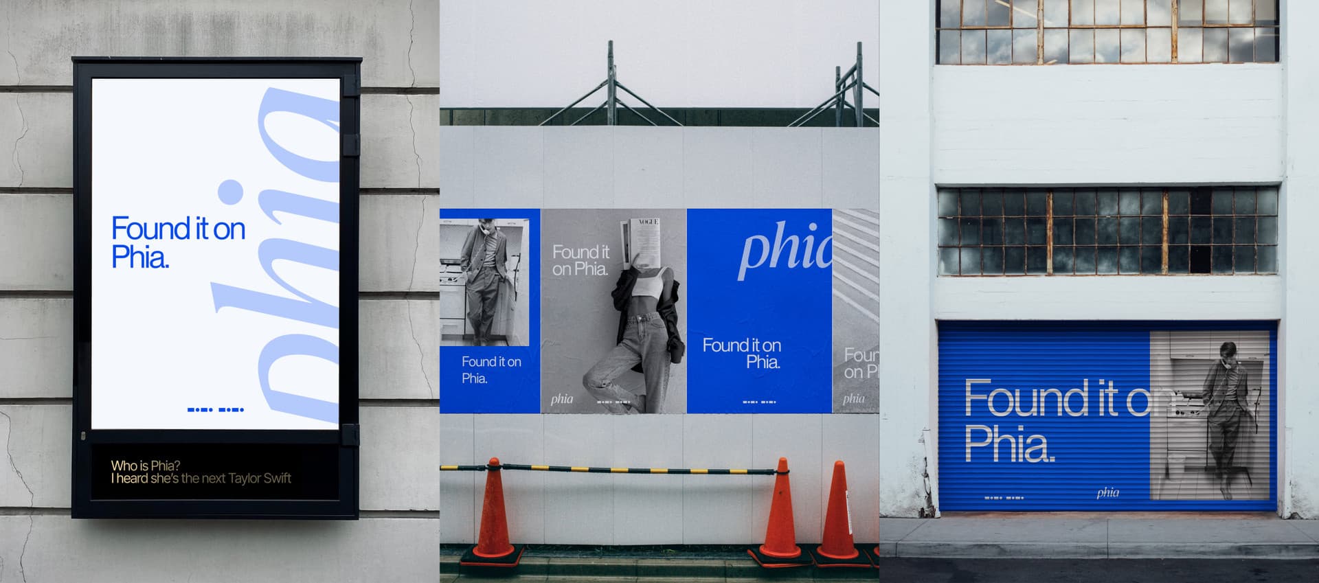
The campaign mockups turn the volume up. Fashion photography sits beside broad fields of blue, and the wordmark becomes part of the composition. “Found it on Phia” gives the imagery a small story: a discovery, with somewhere to find it. Across posters, a shutter, and a billboard, the balance changes while the ingredients stay familiar.
In the Product
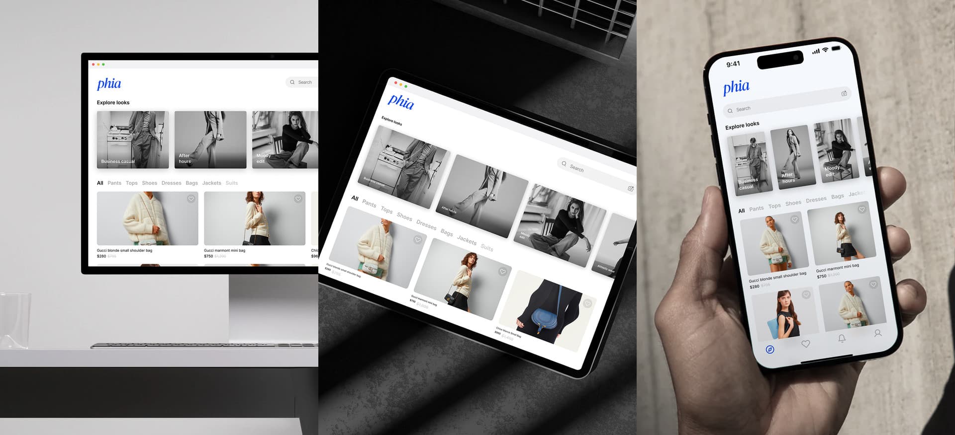
The product mockups turn the volume down. Across desktop, tablet, and phone, the wordmark gives the interface a recognizable point of entry while the pale surfaces leave room for fashion photography. Blue becomes an accent: enough to connect the experience to the campaign without competing with the clothes.
This is where the range of the identity becomes useful. On the street, Phia can take the whole frame. In the product, it makes room for the next discovery.