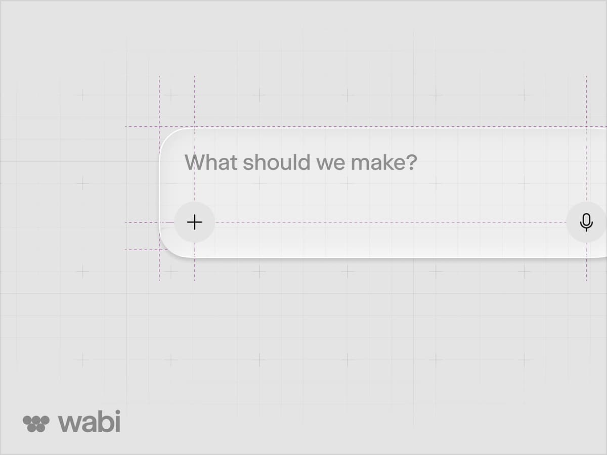
Wabi is a platform for creating, discovering and remixing personal software. Every app inside it can look different. The interface around those apps needs to feel familiar.
As a founding designer, I worked with the team on a shared design system for iOS, Android and the web. It brought the brand into the product and gave us reusable foundations for designing new features.
Familiar Across Platforms
The system gives screens a common structure while leaving room for each platform's conventions. Navigation, sheets and controls adapt to their surroundings, so the team can focus on the experience inside them.
Material follows the same principle. Glass surfaces on iOS and the web become simpler fills on Android, keeping the interface recognisably Wabi while respecting the platform.
A Shared Visual Language
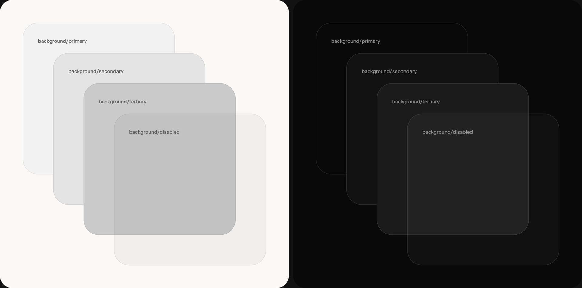
Colour, type and material establish the hierarchy. Background roles carry the same meaning in light and dark mode, helping content stay clear as the interface changes.
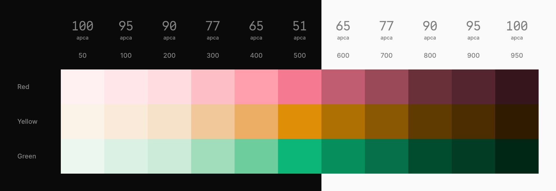
The colour palette gives components a consistent range to draw from, with contrast considered across light and dark surfaces.
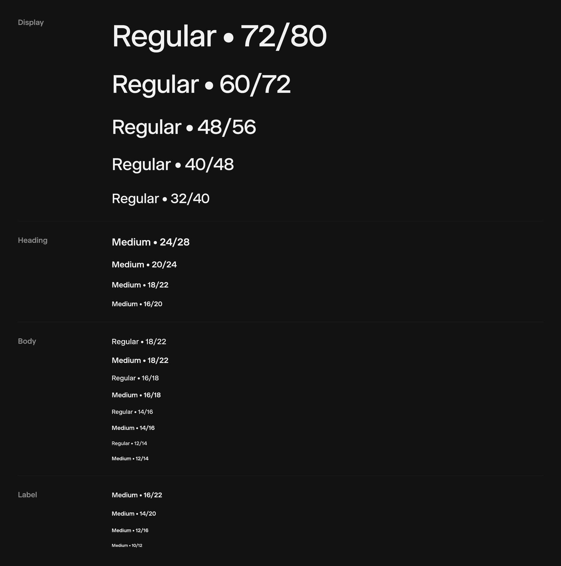
Selecta, chosen by Studio Dumbar for Wabi's identity, connects the product to the brand. A shared set of styles carries it from large statements to everyday controls.
Built to Be Used
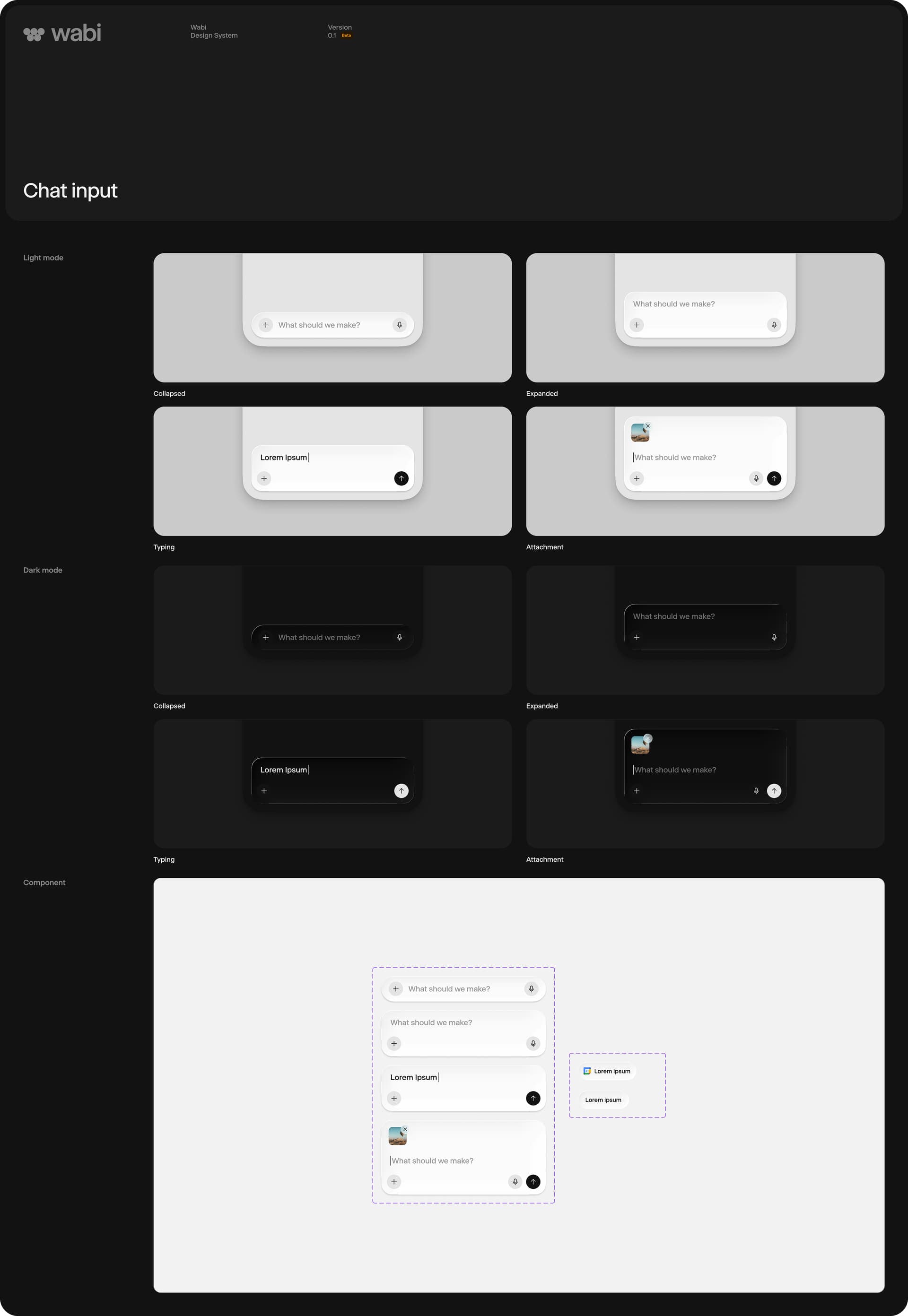
Reusable parts covered the everyday interactions, from sheets to the composer where an idea becomes an app. The composer grows with a thought, makes room for attachments and changes as someone begins typing.
Examples and documentation sit alongside the components, helping the team understand how the parts fit together.
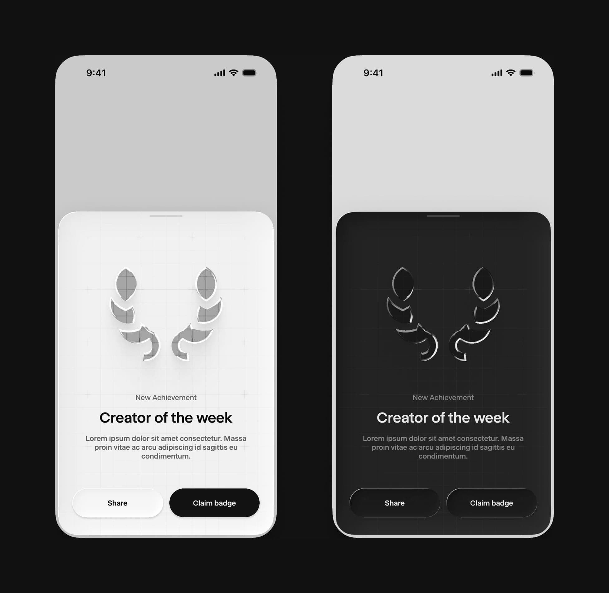
Those foundations also left room for more expressive moments. The creator recognition designs bring a glass wreath into a familiar sheet, using the same material, type and buttons as the rest of the system.
The aim was a shared foundation the team could keep building on, with enough consistency to feel familiar and enough flexibility for what came next.